Images by Manoog
Sam Manoogian’s portfolio. A full-bleed harbor photograph opens the page and the type stays out of its way; underneath, three plain lines about portrait, landscape and event work, then the gallery.
- Trade
- Portrait, landscape & event photography
- Made
- Site, services, gallery, contact
- Runs on
- WordPress + Divi
- Live at
- imagesbymanoog
.com
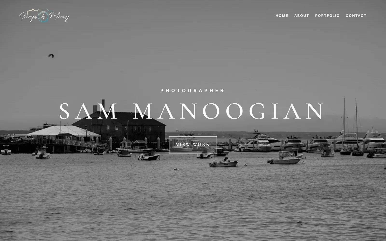
The brief
Sam Manoogian is a photographer, which leaves the site one real job: get out of the way. It had to open on a single frame worth stopping for, say in three lines what he shoots, and put the portfolio one click from anywhere.
Decision 01
The site has no palette. The photographs are the palette.
A white ground, two grays and one blue for links — that is the whole system. A brand color here would have to sit next to thirty-six photographs and either lose to them or take them down with it.
- Display
- High-contrast serif, letterspaced caps
- Navigation
- Inter
- Body
- Open Sans 400
Sampled from the live site: four neutrals and one blue, and the blue is only ever a link. Every other color on that page comes out of a photograph.
Decision 02
Three lines about the work, and then stop talking.
Portrait, landscape, events. Each gets a sentence and a picture, because a photographer who explains himself at length is a photographer whose pictures are not doing it.

Decision 03
The gallery keeps every frame in its own shape.
A portrait cropped square is a different photograph. The grid runs in columns so nothing is trimmed to fit a row, and opening one puts it full size on near-black. Rebuilt here from the site’s own photographs — the behavior, not the plugin stack underneath it.
Live · the real component, running here
Twelve of his thirty-six photographs. Click one — or tab to it and press Enter — and it opens full size on near-black; the arrows, and the left and right keys, move through the set. Rebuilt here, not lifted.
The rebuilt lightbox behaving the way it behaves live: open a photograph, step through a few more, close — not a screenshot of the grid.